How Bloomberg Terminal UX designers conceal complexity
December 06, 2022
Every year, the global capital markets grow in size, number, and complexity. There’s more data, and more types of data, all the time. Bloomberg updates how the Bloomberg Terminal presents that data to users, so they aren’t overwhelmed. This means that Bloomberg’s UX designers have to think very carefully about how information is conveyed. Even something as simple as a font change or the relocation of a button can be disruptive. Fortunately, Bloomberg was a pioneer in the field of UX, and the company continuously evolves the design of the Terminal, 40 years on.
The secret to dealing with this increasing complexity, says Bloomberg CTO Shawn Edwards, is to conceal it from the user, to prevent confusion or workflow disruption.
“We’re hiding complexity,” he says. “And we do it across thousands of functions, across domains and asset classes, so the user has a seamless experience through their whole journey within the Terminal.”
(1:00) Over 350,000 financial decision makers rely on the Bloomberg Terminal, every day. When our UX team makes changes, they ensure no one misses a beat.
We have to balance innovation with familiarity.
Find out how our UX team rolls out incremental changes to the Bloomberg Terminal’s interface every day – without disrupting our users’ workflows.
Featured
What did you do?!
When UX Framework Manager Ali Jeffery first joined the UX team in 2008 as a visual design lead, Bloomberg was completing the rollout of a font update.
“The change was so dramatic for some users,” she recalls. “I think we got thousands of messages like, ‘What did you do? You changed the color. You changed perfection. I have a headache! I need Tylenol!’ Some users had an incredibly strong reaction.”
But the font needed to change.
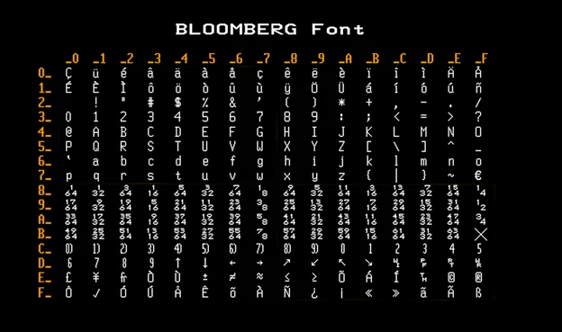
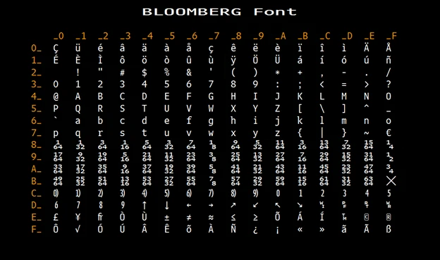
Back in the late 90’s, the team had copied over the original 9×19 mono-spaced font pixel-by-pixel by hand from the original Terminal hardware for the sake of continuity, now that the Terminal was running on Windows. But a move from an old rendering system to GTK (an open source widget toolkit) around 2007 meant the team could now use font authoring tools to convert the original bitmap font to TrueType, and then fine tune the curves.
The team commissioned Matthew Carter CBE, the British typographer who created the classic Georgia, Verdana and Tahoma fonts (among many others), to create both proportional and mono-spaced fonts for the Terminal. The new font also included special glyphs designed for use in finance, such as fraction glyphs with a granularity of 1/64ths (fonts normally only have ½ , ¼, ¾, plus maybe a couple more).


Jeffery notes that the new font “still had the ethos of the old controller, but moved us forward with a more modern font suite and rendering of them.”
The new font’s rendering on the screen appears thicker than the previous one, making it easier to read. Based on feedback, the team toned down the new color. Users eventually got used to the new font, and the UX team learned an important lesson about how UX needs to be a two-way street.
“Many of our users have high-pressure jobs, and they’re using the Terminal to make mission-critical decisions,” says Edwards. “Change is not always welcome, but we have to constantly add new capabilities and improvements even if users aren’t asking for them.”
Making substantial changes, even good ones, will reliably annoy a percentage of customers, so Jeffery’s team plans redesigns with incremental updates that roll out over weeks or months. For example, when they wanted to flatten the gradient of an element, they wouldn’t do so all at once, instead changing it little by little each month. They also often release updates on Friday nights, so clients will have the whole weekend to get used to the update before Monday’s opening bell.
“The concept of user acceptance is really important,” says Ash Brown, Bloomberg’s Global Head of UX. To prevent negative reactions, UX teams go through rigorous testing prior to a release, and they conduct interviews with users to get them involved in proposed updates from the outset, before the concepts are even fully formed.
Designing with empathy
“Often, new ideas come from our users, and we take those suggestions very seriously,” says Brown. “However we don’t want to fall into the trap of acting on the exact request a user makes, especially if it’s a one-off request.”
“We approach design with empathy for the user,” says Brown. “That doesn’t necessarily mean taking the prescribed solution they give you, but truly attempting to understand what they’re going through, understanding their goals and motivations.” That, Brown asserts, leads to the best results for the whole user community.
Some of Brown’s team members come from engineering backgrounds, others come from finance, design, and psychology. The heterogeneity of the group enables them to see problems from multiple perspectives, and to put themselves in the shoes of the user.
“We have to learn to judge not by initial reaction,” says Fahd Arshad, UX Manager in the CTO’s Office. “Our conversation is almost never about desirability; it’s about what value the users will get. We know we need to create enough of an increase in value that, even if they initially complain about the change, in a couple of days they’re gonna say, ‘Yeah. This is it. This is what I need. I get it now.’”
Having empathy requires lots of conversations and observation of how users really behave in the real world. Bloomberg’s Product and UX teams perform hundreds of interviews and usability sessions with customers annually, in addition to maintaining open lines of feedback via the Analytics and Sales departments at all times.
“I love the sense of comradery we have with our clients,” says Arshad. “We are partners, we are trying to solve their problems, and they’re giving us feedback on how we can solve them better. I don’t think many consumer-facing organizations have the luxury of operating in this fashion.”
Seamless, subtle, and stable
The Bloomberg Terminal is used 24/7 to track various financial markets around the world at any given time.
“Our technology teams have spent years perfecting a system for which we can roll out changes every single day without causing any downtime, without affecting any users,” says Edwards. “It’s a real effort in coordination across our technology teams, our Sales teams, and our UX teams, to manage change at this scale and not be disruptive to our users.”
“We typically update the Terminal client software that actually runs on your PC once a month,” says Paul Williams, Head of Application Frameworks – London. “We have been doing that for decades now. However, so much of the Terminal is programmed with dynamic rules that can change overnight. So, you can’t really think purely in terms of the monthly release. Much of our software moves out on a one- to two-week cycle. And in an emergency, we can deploy new software overnight or roll something back instantly if needed.”
When releasing major updates, the UX teams lay the groundwork by alerting users to pending changes, and giving them the opportunity to delay updates until they’re ready for them.
“It’s very rare that we would simply turn on a major feature without any warning. We aim to ensure our users are notified the change is coming, understand the value being delivered and the impact to their workflows and – for really big changes – can try out the feature before the release is complete,” says Brown.
“The majority of our updates are incremental in nature and we can roll them out without really affecting our clients’ workflows. But to move our product forward, we occasionally must make major changes. Our research – combined with past experience – shows that clients need some leeway. Offering them a sense of control and the ability to ease into new features dramatically changes how our clients respond to and adopt these changes in the long run,” says Arshad.
The goal is for back-end changes to be imperceptible to the user. For example, when Instant Bloomberg (IB), the Terminal’s messaging application, received a major update, few knew.
“Most users wouldn’t notice any difference from IB Version 1 unless they started to explore some of its new, more powerful features,” says Williams. “Nobody had a clue that it was actually running on an entirely different software stack.”
The team often supports two versions of the same feature simultaneously, so users can opt-in at their convenience and comfort. Sometimes they’ll replicate old, undesirable UX features in a new release just to ensure back-end stability. Then, once stability has been confirmed, roll out the new UX design.
“If you change the experience and the technology at the same time, and the experience is rejected by the user, you now have to revert the technology too,” says Brown. “And that’s not a good thing.”
“We have sophisticated systems for controlling runtime behavior via switches that are centrally controlled,” says Williams. “This allows us to deploy software updates in advance, then switch an increasing number of groups of users over to them gradually. This staggered approach gives us an effective early warning system for updates that may cause problems.”
When it comes to Terminal software updates, stability is job number one. The Terminal is complex, and how changes to one subsystem may impact another can often be difficult to anticipate or measure. Stability can mean protecting against displaying wrong data, preventing crashes, or maintaining the capacity to process all data and user interactions in real time without slowing down. Preventing any of these negative outcomes means testing as much as possible within Continuous Integration systems, running pre-releases through Quality Assurance teams, and constantly measuring results. For example, one team of engineers in Bloomberg’s Hong Kong Office is dedicated to desktop telemetry, which measures the performance of different Terminal applications.
“I think of the ecosystem of client Terminals like a living, breathing thing,” says Williams. “It’s a virtual data center that we can’t see or touch, but that we care immensely about.”
Changes, big and small
Four decades on, there are still significant changes to be made to how the Terminal looks and feels. The pandemic forced financial professionals to work out of their homes, and on screens of many sizes. Traditionally, the Bloomberg Terminal has been confined to a specific square of information — no matter how big the screen, you see the same data, bigger. That’s all changing, and the pandemic accelerated the shift toward dynamic window sizes.
Under the new UI, users are able to resize windows so they can see more or fewer rows and columns on a spreadsheet, news articles in a feed, or messages in a chat window. In addition, the longstanding four-panel maximum in the desktop layout has gone away. The Terminal has moved toward a tabbed panel model where users can fully customize their workflow by displaying an arbitrary number of tabs or windows on their screen(s).
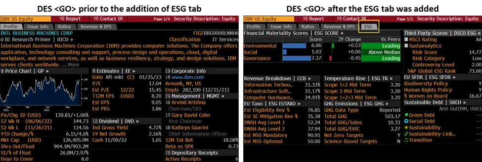
The addition of an Environmental, Social, & Governance (ESG) tab to the Security Description (DES <GO>) page on the Terminal in February 2022 is a good example of a smaller feature update that adds significant value to Bloomberg’s clients. This addition was born out of the rising importance of corporate social responsibility initiatives and their impact on users’ investment strategies.

The ESG tab provides an overview of a company’s environmental, social, and governance-related data, so investors can assess associated ESG risks and opportunities. Each section header lets Terminal users access more data and analytics in other functions.
While it’s a small update, when you look at all the similar tweaks over the last 40 years, you can get a sense of how much thought has gone into making the Terminal look and feel like it does today.
“Is it super radical?” asks Flatman. “No, it’s a new tab on a familiar screen. But it’s valuable to our users, and they’ll look at it and they won’t feel shocked by it. They’ll just get an immediate benefit from it.”


